clip-path
什么是 clip-path
剪裁,可以按照 svg 路径、盒子模型、基本多边形路径等几种不同的方式来裁切。
clip-path 主要分三类,分别为:
basic-shape: 基本图形,包括 inset()、circle()、ellipse()、polygon()clip-source: 通过 url() 方法引用一段 SVG 的 <clipPath> 来作为剪裁路径geometry-box:单独使用时,将指定框的边缘作为剪裁路径,或者配合 basic-shape 使用,用于定义剪裁的参考框(Reference Box)(由于该属性浏览器支持度比较低,本文暂不讨论)
svg 剪裁
语法:clip-path: url ()
先定义一个svg路径。
1
2
3
4
5
6
7
8
| <svg height="0" width="0">
<defs>
<clipPath id="svgPath">
<path id="heart" d="M 250 500 Q 50 250 200 350 Q 200 350 300 450 Q 300 150 350 350 C 400 400 400 150 450 450 C 500 450 600 400 600 250 A 50 50 0 1 1 250 500 Z" />
</clipPath>
</defs>
</svg>
<img class="clipImg" src="https://pic.qqtn.com/up/2019-9/15690311636958128.jpg" />
|
然后给元素加上clip-path: url(#id),其中id 为 clipPath 标签的 id。
1
2
3
4
| .clipImg{
width: 800px;
clip-path:url(#svgPath)
}
|
基本图形
矩形
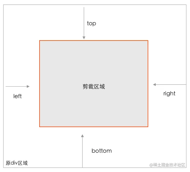
按矩形剪裁,语法 clip-path:inset(top,right,bottom,left);
1
| clip-path: inset(10% 10% 10% 10%);
|
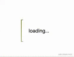
一个动画 demo
1
2
3
4
| <div class="outer">
<div class="border"></div>
<div class="text">loading...</div>
</div>
|
1
2
3
4
5
6
7
8
9
10
11
12
13
14
15
16
17
18
19
20
21
22
23
24
25
26
27
28
29
30
31
32
33
34
35
36
37
38
39
40
41
| .outer {
position: relative;
width: 100px;
height: 100px;
}
.text {
position: absolute;
left: 50%;
top: 50%;
transform: translate(-50%, -50%);
}
.border {
width: 100%;
height: 100%;
text-align: center;
line-height: 100px;
border: 2px solid;
border-image: linear-gradient(45deg, rgb(184, 159, 218), rgb(15, 48, 194)) 1;
clip-path: inset(0 96% 0 0);
animation: clipPath 5s infinite linear;
}
@keyframes clipPath {
0%{
clip-path: inset(0 0 96% 0);
filter: hue-rotate(0deg);
}
25% {
clip-path: inset(0 96% 0 0);
}
50% {
clip-path: inset(96% 0 0 0);
filter: hue-rotate(360deg);
}
75% {
clip-path: inset(0 0 0 96%);
}
100% {
clip-path: inset(0 0 96% 0);
filter: hue-rotate(0deg);
}
}
|
圆形
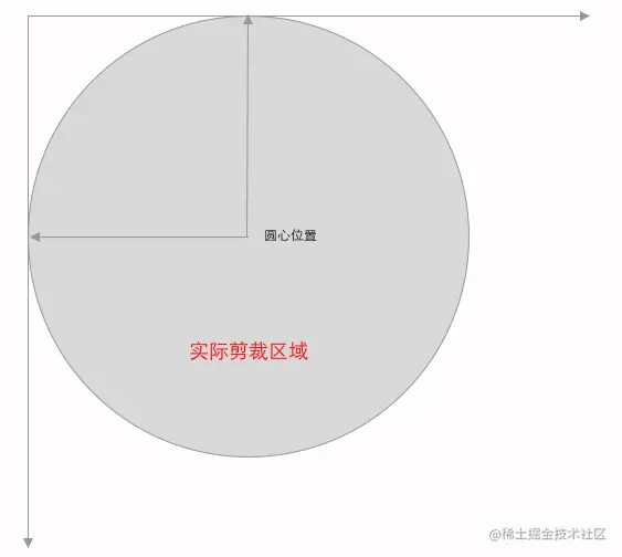
按圆形剪裁,语法 clip-path:circle(50% at 50% 50%),at 前的50%代表半径为50% , 后面的 50% 50% 代表圆心的位置。
椭圆
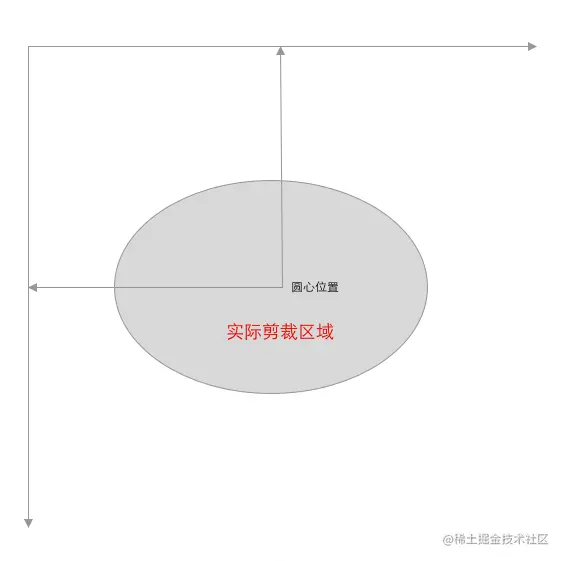
按椭圆剪裁,语法clip-path: ellipse(50px 60px at 0 10% 20%); at 前参数为圆心位置,at后面参数为椭圆半径。椭圆就是基于圆形变化而来,参数含义结构都是类似的,只是半径不是一个值。
多边形
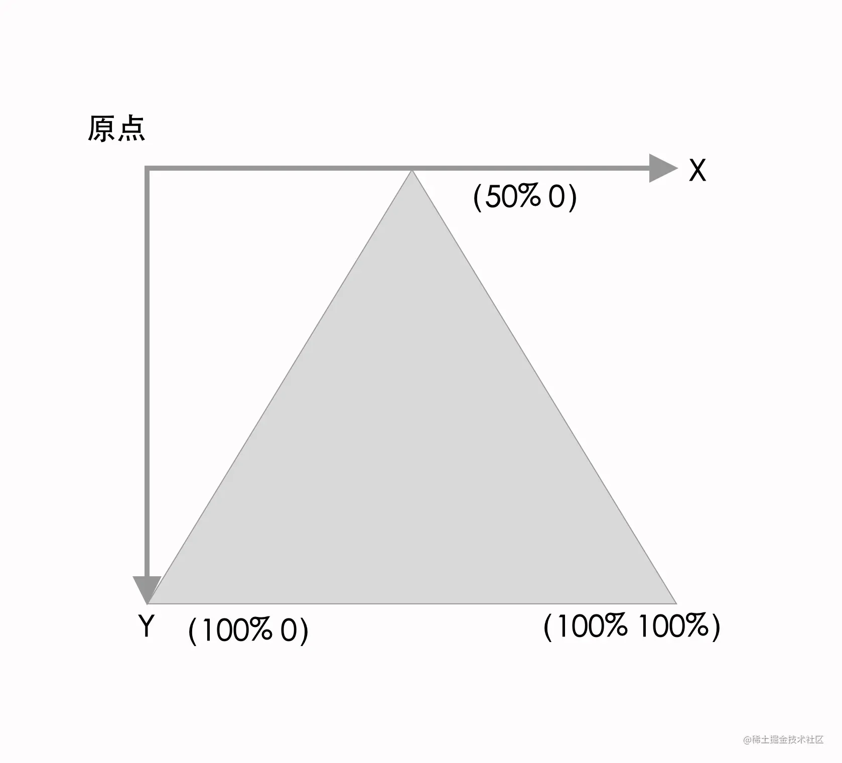
按多边形剪裁,语法 clip-path: polygon(30% 50%,20% 10% ,20% 10%),每个具体的点位之间用『逗号』分割,每个具体的点位由(x y)组成;点位个数不限。以三角形为例说明具体数值含义:
也正是因为 polygon 点位数不限的灵活性,可实现多种形状的剪裁,例如五角星,多边形等。
1
2
3
4
|
clip-path: polygon(50% 0%, 61% 35%, 98% 35%, 68% 57%, 79% 91%, 50% 70%, 21% 91%, 32% 57%, 2% 35%, 39% 35%);
clip-path: polygon(50% 0%, 100% 38%, 82% 100%, 18% 100%, 0% 38%);
|
参考
https://juejin.cn/post/7163075335058096141